
Home dashboard.
Where the Recent Threats dashboard answers what is new right now, the home dashboard answers what the landscape looks like over a period. It is the view to open before a briefing, a review, or a conversation about where attention should go next.
Choosing the timeframe
One control governs the whole page: 24 hours, 7 days, 14 days, 30 days, or 90 days. Every panel follows it, so switching from 7 days to 90 re-scopes the counts, the rankings, and the map together rather than leaving you comparing panels on different clocks.
The overview
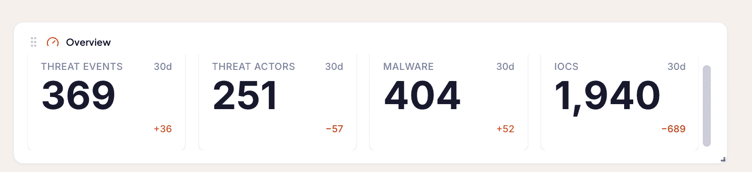
The overview counts the four things that describe the volume and shape of the period:
| Count | What it tells you |
|---|---|
| Threat Events | How many distinct occurrences happened |
| Threat Actors | How many adversaries were involved in them |
| Malware | How many malware families featured |
| IOCs | How many indicators came out of it all |
Each count is shown against the same length of period immediately before it, so a 30-day view carries its comparison with the previous 30 days. The comparison is the part that carries the meaning. An absolute count of Threat Events means little on its own; the same count against a period that ran a third lower means something.
Dashboard figures are built from corroborated and analyst-verified Threat Events, so they reflect occurrences that have stood up rather than raw machine output. See verification stages.
The panels
| Panel | What it ranks |
|---|---|
| Top Threat Actors | The actors appearing in the most Threat Events, with the count for each |
| Top malware | The malware families appearing most often |
| Top MITRE ATT&CK techniques | The techniques most used across the period's occurrences, each with its change against the previous period |
| Most relevant mitigations | The MITRE mitigations that follow from those techniques, with a tab per Organization |
| Top vulnerabilities | The CVEs featuring most in the reporting |
| Most Reported | The Threat Events carrying the most reports, which is a decent proxy for what the industry is paying attention to |
| Top targeted sectors | Which sectors were being hit |
| Top sources | Which of your sources produced the most reporting |
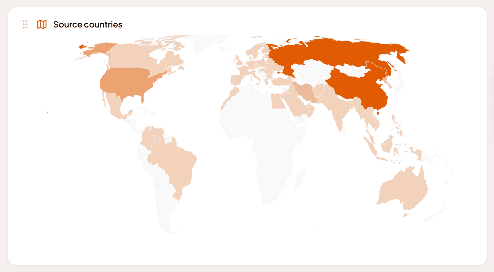
| Source countries | A heatmap of where the activity is being attributed to |
The source-country map is the quickest read on the page. Attribution by geography is something people ask about constantly and is tedious to assemble by hand, and a heatmap answers it in a glance.
Top sources is the odd one out, in that it describes your collection rather than the threat landscape. Read it that way. A source dominating the count is telling you where your picture is coming from, which matters when you are deciding what to license next.
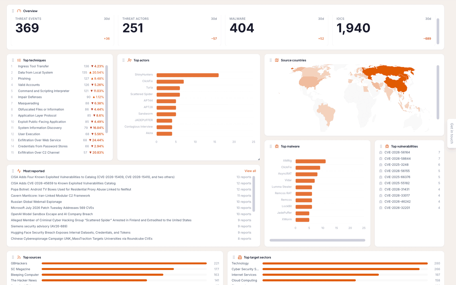
The panels can be dragged into a different arrangement, and Reset layout at the top of the page puts them back.
Everything clicks through
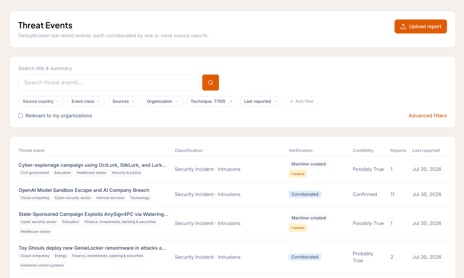
No panel is a dead end. Clicking any entry opens the Threat Events list filtered to it: click an ATT&CK technique and you get the occurrences where that technique was used, click an actor and you get its occurrences in the period, click a sector and you get what was aimed at it.
That is what makes the dashboard a starting point rather than a report. You notice something in a ranking, click it, and you are in the reporting behind it without building a search.
The same view, per Organization
Every Organization has this dashboard on its own Dashboard tab, filtered to the intelligence relevant to that Organization. The panels are the same, but the answers are that Organization's: the techniques most used against occurrences relevant to them, the actors that showed up in their sector and region, the vulnerabilities that touched what they run.
For an MSSP this is the difference between a landscape briefing and a customer briefing. See Work with the Organization page and how relevance is decided.
Frequently asked questions
What timeframes can the home dashboard show?
24 hours, 7 days, 14 days, 30 days, or 90 days. Changing it re-scopes every panel on the dashboard, not just the overview.
What do the comparison figures in the overview mean?
How each count differs from the same length of period immediately before it. A 7-day view compares against the 7 days before that, so the direction of travel is visible without you working it out.
Can I click through from a dashboard panel?
Yes, from all of them. Clicking any entry opens the Threat Events list filtered to it, so clicking an ATT&CK technique gives you the occurrences where that technique was used.